Himanshu — Product Work
eCommerce | Logistics | Analytics | productcraftlabs.com
This portfolio and productcraftlabs.com were designed and built using AI-assisted tools. I use Claude, Figma, GitHub, and Canva as part of my product craft — because modern PMs should know how to build, not just specify.
8+ years building products across eCommerce, Logistics, and Analytics. These case studies reflect how I approach problems, not just what got shipped.
I led the redesign of a cross-border shipment processing workflow in a central warehouse where bundled shipments were creating bottlenecks at the final packing station. By introducing a new bundle-processing mechanism and dynamic operational controls, we significantly increased throughput while reducing operational costs.
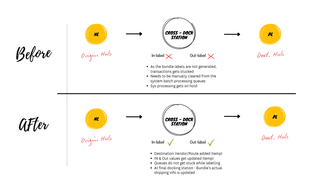
Cross-border shipments consisted of multiple individual orders grouped into bundles before being transported to cross-docking stations.
The existing process required both individual shipment labels and bundle-level labels to be completed before the system allowed transportation. This dependency created processing bottlenecks, causing items to accumulate at final packing stations and limiting warehouse throughput.
I analyzed the operational flow and identified that the system was treating shipment-level and bundle-level validations as a single blocking event. I redesigned the workflow to decouple these dependencies.
The new mechanism:
- Temporarily validated individual shipment labelling
- Flagged bundles as “Ready to Ship”
- Routed completed bundles to dedicated packing stations
- Performed final verification before dispatch
I also introduced a configurable module that warehouse operators could enable or disable through an EWM Fiori application depending on operational load.
Prioritized
- Decouple shipment-level and bundle-level validations
- Introduce dedicated bundle processing lanes
- Build operational flexibility through feature toggles
De-prioritized
- Increasing manual workforce (high cost, temporary solution)
- Queue override mechanisms (would simply shift the bottleneck downstream)
Collaborated with:
- Supply Chain Product Owners
- Solution Architects
- Development teams
- Warehouse Operations teams
- Data Analytics teams
Systems involved:
- SAP – ERP | EWM | Fiori
- ✅ Increased throughput from 1.8K → 2.7K Parts Per Hour (+50%)
- ✅ Reduced warehouse congestion
- ✅ Improved cross-border shipment flow
- ✅ Delivered approximately €200K annual cost savings
I led the creation of a unified analytics platform that consolidated retail, catalogue, order, and inventory insights across multiple brands and regions. Built a single source of truth across brands, regions, and channels, reducing manual effort by 80%.
Multiple stakeholders across brands and regions requested separate dashboards, leading to fragmented reporting, inconsistent metrics, and heavy manual effort.
There was no centralized view across: Orders, Sales, Inventory, and Catalogue performance.
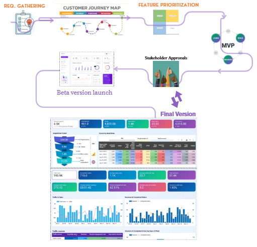
I worked closely with stakeholders to understand their decision-making needs rather than simply collecting reporting requirements. I designed a unified dashboard framework that allowed users to filter by Brand, Region, Individual stores, and Physical vs online inventory. We continuously iterated based on stakeholder feedback.
Prioritized
- Standardized KPI definitions
- Self-serve filtering capabilities
- One platform supporting multiple brands
Collaborated with teams across:
- OMS
- ERP
- PIM
- CMS
Technologies used:
- SQL
- Power BI
- Tableau
- ✅ 100% stakeholder adoption
- ✅ 80% reduction in manual reporting effort
- ✅ Unified reporting across brands and regions
- ✅ Established a single source of truth for business metrics
I led a large-scale data modernization initiative to migrate legacy warehouse management data into Google BigQuery, enabling advanced analytics capabilities while minimizing operational risk.
The existing legacy systems were becoming increasingly difficult to scale and were unable to support advanced analytics use cases.
Key risks included: Data integrity concerns, Infrastructure limitations, Increasing maintenance overhead, and Potential operational disruption.
I partnered with technical architects to break the migration into four manageable phases. We prioritized datasets based on business impact and established validation checkpoints throughout the migration journey.
To minimize risk, I introduced: Phased migration strategy, Parallel system runs, Proof-of-concept validations, and Cross-functional stakeholder alignment.
Prioritized
- Data reliability over migration speed
- Incremental rollouts
- Early stakeholder buy-in
Collaborated with:
- Technical architects
- Data analytics teams
- Supply chain stakeholders
Systems involved:
- SAP ERP
- SAP EWM
- Google BigQuery
- ✅ Successfully migrated 15 years of multi-terabyte WMS data
- ✅ Zero operational disruption
- ✅ Established scalable analytics infrastructure
- ✅ Enabled predictive analytics use cases
- ✅ Reduced long-term technical constraints
I redesigned warehouse storage allocation logic to improve storage utilization, reduce unnecessary picker movements, and accelerate order fulfillment.
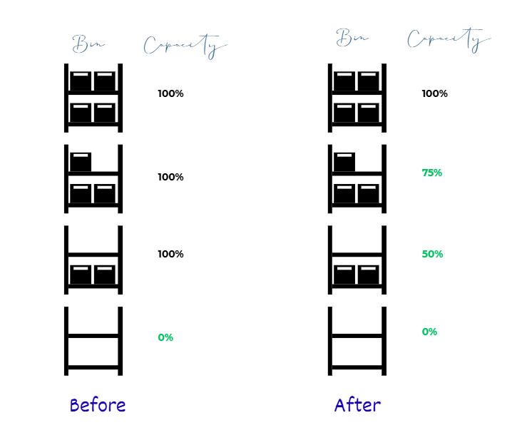
The existing warehouse management system allowed inventory to occupy a storage bin until it was completely empty, resulting in: Underutilized storage capacity, Excessive picker travel distances, Increased pick/put-away effort, and Slower fulfillment cycles.
I conducted monthly sessions with warehouse managers to understand operational inefficiencies. Based on these insights, I redesigned the storage allocation logic to dynamically optimize bin utilization.
The solution: Suggested inventory consolidation into lower floors, Updated bin capacities in real time (25%, 50%, 75%, 100%), and Recommended optimal pick locations based on proximity and order quantity.
Prioritized
- Dynamic capacity management
- Real-time inventory updates
- Proximity-based picking recommendations
De-prioritized
- Mixed inventory bins (operational complexity)
- Intermittent inventory shelves (high maintenance overhead)
Collaborated with:
- Warehouse managers
- Data analytics teams
- Solution architects
- Supply chain stakeholders
Systems involved:
- SAP ERP
- SAP EWM
- ✅ Reduced pick/put-away trips by 14% monthly
- ✅ Improved throughput by 5%
- ✅ Accelerated order fulfillment
- ✅ Contributed to approximately 5% YoY revenue growth
A detailed documented product discovery artifact for the order return process, focusing on user persona, weighted and evaluated solution formation, execution outlined and covered with a case study.
Live interview based document outlining how a customer feels when they share their concerns for a product, and how this can be translated to the business solution building.
A lightweight Android app that aggregates listings from major Indian job portals, scores each against a user’s profile, and surfaces only high-relevance matches — eliminating portal-hopping entirely.
- → Optimising for time saved ≥40 min
- → North star metric: Daily time saved on job discovery >75%
- → Match score accuracy: Listings shown feel relevant >30%
The Problem — Netflix knows what you watch. It doesn’t know what you love.
There’s a meaningful difference between something you watched and something that genuinely moved you. Netflix’s current experience flattens that distinction. Your taste exists implicitly in the algorithm, but there’s no place to make it explicit — no space to say: these ten titles define me as a viewer. The social layer on Netflix has always felt underdeveloped — you can share what you’re watching, but not what you stand behind.
My Thinking Process — The difference between sharing content and sharing taste
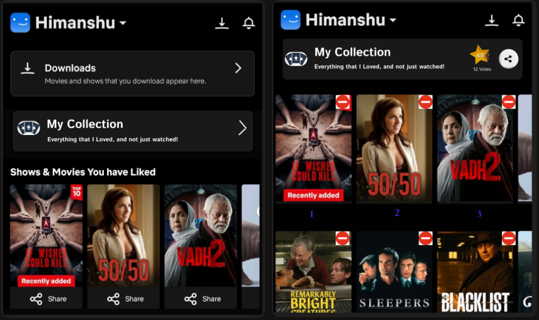
I started from a simple behavioural observation: people already do this informally. They make Letterboxd lists, tweet their top 10s at year-end, send voice notes raving about a series. The desire to curate and share taste is native — Netflix just hasn’t given it a home. A ranked, curated, limited list — ten titles — forces intentionality. It’s not a watchlist dump; it’s a statement.
The Feature — Your Top 10, curated, social, yours
Each Netflix user gets a personal “My Top 10” space — a fully customisable shelf that lives on their profile. You choose up to ten titles from anything on the platform, rank them however you like, and optionally add a one-line note for each. Connections can vote on your selections — not to change the ranking, but to signal resonance.
Why It Works — Trust travels further than an algorithm
The feature solves something Netflix’s recommendation engine structurally can’t: it makes discovery social and intentional. When a friend puts something in their Top 10, it carries weight that “Because you watched X” never will.
The Problem — Listening is personal. Spotify treats it as passive.
Music is rarely just background sound. Songs attach themselves to moments — a road trip, a late night, a loss, a beginning. Spotify’s data tells artists how many streams they have. It doesn’t tell them why a song hit someone the way it did. And for listeners, that emotional relationship with a song has no outlet — no channel back to the artist.
My Thinking Process — What does an artist actually want to know about their listeners?
I thought about this from both sides. For a listener, the impulse to share “what this song means to me” is real but currently homeless. For an artist, streams and playlist adds are gratifying but thin. The design challenge was finding a format that’s intimate enough to feel personal but structured enough to be surfaceable. A short paragraph, attached to a specific song, submitted voluntarily — that’s the right unit.
The Feature — A story for every song that earned one
On any song page, listeners see a “My Connection” prompt — an optional space to write a short personal story (capped at 250 characters) about what this song means to them. Artists and their teams can browse stories, and if one resonates, they can amplify it — featuring it on their artist page or responding directly.
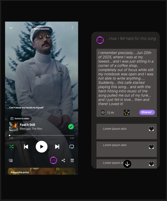
Why It Works — It makes music personal on both sides of the speaker
This feature works because it doesn’t try to replace what music already does — it creates a channel for what music already makes people feel. For artists, it replaces a black box of stream counts with actual human signal.
The Problem — Your best statuses disappear in 24 hours
WhatsApp Status was designed to be ephemeral — and that’s largely a feature, not a flaw. But there are moments worth keeping. Right now, once 24 hours passes, those are gone — and you lose the context of who saw it, who reacted, who reached out because of it.
My Thinking Process — Not a highlight reel, a personal archive
The instinct might be to build a “highlights” feature — publicly showcasing your best statuses, Instagram-story-style. But that misses the point. What users actually want is something quieter and more private: a personal record of the moments they chose to share, visible only to themselves.
The Feature — Save before it disappears, just for you
While a status is live, a simple “Save to Archive” option appears in the status controls — one tap, no friction. Saved statuses are stored in a private, end-to-end encrypted archive accessible only to the user, organised chronologically. Each archived status retains the viewer and reaction data it had at the time of saving.

Why It Works — It respects what WhatsApp already is
The best thing about this feature is what it doesn’t try to do. It doesn’t add a social mechanic, create a new feed, or change how Status works for anyone who doesn’t use it. It simply gives users who care about their own history a way to keep it — privately, cleanly, with the context intact.